Card arrangement
Arrange the image and content of cards, and choose where their actions are displayed
Introduction
You can change how the parts of a card are arranged by configuring the arrangement, the shape of the image and the placement of the row actions on the card builder.
Arranging the image and content
You can specify how the image and the content of a card are arranged by setting the Arrangement property on the card builder. The example below displays each trip's title and summary over its cover image:
using StellarAdmin.Resources;

index.AddCards("trips", cards =>
{
    cards.Card(card =>
    {
        card.Arrangement = ResourceCardArrangement.Overlay;
        card.Image(trip => trip.CoverImageUrl);
        card.Title(trip => trip.Title);
        card.Description(trip => trip.Summary);
        card.Badge(trip => trip.Difficulty);
    });
});
The arrangement can be one of the following:
| Member | Description |
|---|---|
Vertical | Displays the image above the content. This is the default. |
Horizontal | Displays the image beside the content. The cards are wider than vertical cards, and when there isn't enough space, the image is displayed above the content. |
Overlay | Displays the title and description over the bottom of the image, with the rest of the content below the image. The overlay arrangement requires an image, and without one the cards are displayed vertically. |
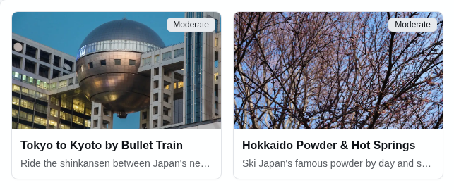



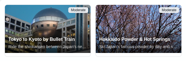

The cards fill as many columns as fit the width of the page. When a vertical or overlay card has an image, the badge is displayed on the image. Otherwise, it is displayed beside the title.
Changing the shape of the image
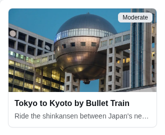
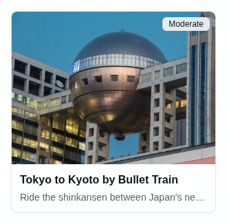
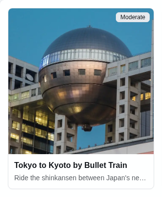
By default, the image has a 16:9 aspect ratio. You can change this by setting the Shape property on the image builder. The example below displays square images:
using StellarAdmin.Resources;

card.Image(trip => trip.CoverImageUrl, image => image.Shape = ResourceCardImageShape.Square);
The shape can be one of the following:
| Member | Description |
|---|---|
Widescreen | Displays the image with a 16:9 aspect ratio. This is the default. |
Banner | Displays the image with a 21:9 aspect ratio. |
Landscape | Displays the image with a 4:3 aspect ratio. |
Square | Displays a square image. |





Placing the actions
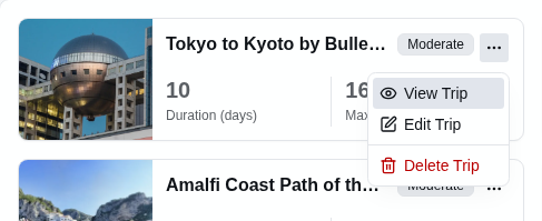
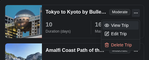
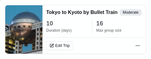
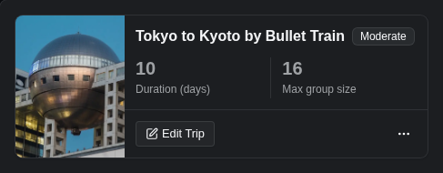
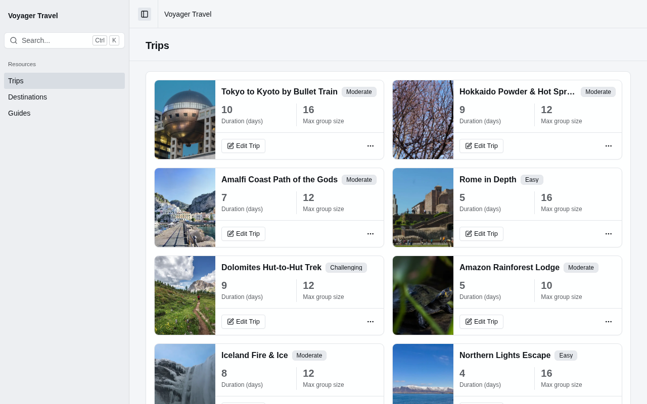
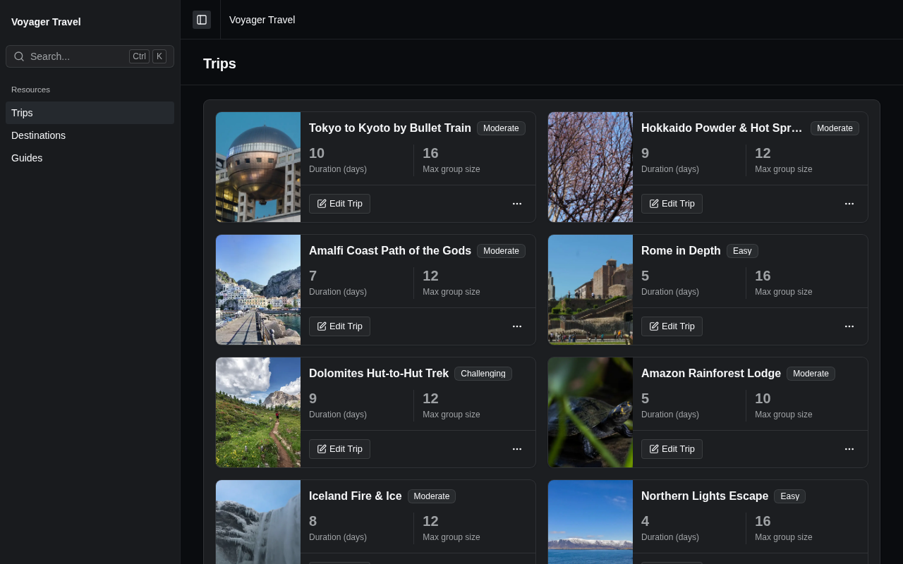
By default, a card displays its row actions in a menu in the card's header. You can display them in a footer instead by setting the ActionsPlacement property on the card builder. The example below displays horizontal cards with square images and the actions in the footer:
using StellarAdmin.Resources;

index.AddCards("trips", cards =>
{
    cards.Card(card =>
    {
        card.Arrangement = ResourceCardArrangement.Horizontal;
        card.ActionsPlacement = ResourceCardActionsPlacement.Footer;
        card.Image(trip => trip.CoverImageUrl, image => image.Shape = ResourceCardImageShape.Square);
        card.Title(trip => trip.Title);
        card.Badge(trip => trip.Difficulty);
        card.Stats(stats =>
        {
            stats.Add(trip => trip.DurationDays);
            stats.Add(trip => trip.MaxGroupSize);
        });
    });
});
The placement can be one of the following:
| Member | Description |
|---|---|
Menu | Displays a ⋯ menu with the View, Edit and Delete actions in the card's header. When the card uses the overlay arrangement, the menu is displayed on the image. This is the default. |
Footer | Displays an Edit button in the card's footer, with a ⋯ menu next to it that contains the Delete action. Users open the view page by clicking the card. |