Cards
Display a resource's records as cards on the index page
Introduction
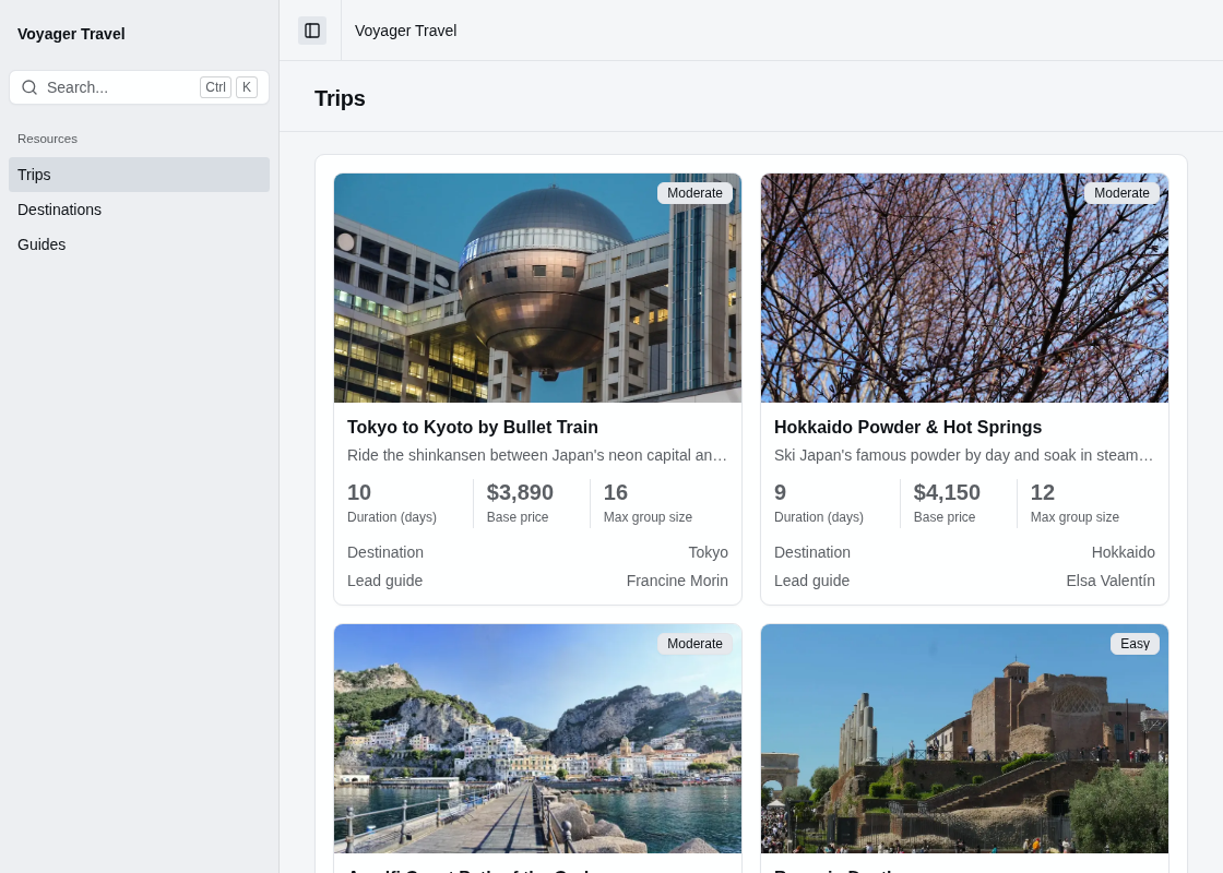
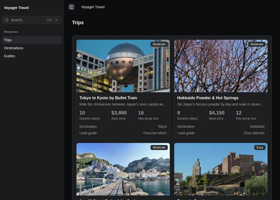
The Cards layout displays each record on the index page as a card in a grid, instead of a row in a table.
Adding the cards layout
You can add a cards layout to the index page by calling AddCards() on the index page builder, and then configuring the parts of each card by calling Card() on the cards builder. The first argument of AddCards() is the data layout's key, which must be unique within the index page.
The example below displays each trip as a card with its cover image, title, summary, difficulty, three stats and two fields:
using StellarAdmin.Resources.Displays;

builder.Services.AddStellarAdmin(admin =>
{
    admin.AddEfCoreResource<Trip>(resource =>
    {
        resource.Index(index =>
        {
            index.AddCards("trips", cards =>
            {
                cards.Card(card =>
                {
                    card.Image(trip => trip.CoverImageUrl);
                    card.Title(trip => trip.Title);
                    card.Description(trip => trip.Summary);
                    card.Badge(trip => trip.Difficulty);
                    card.Stats(stats =>
                    {
                        stats.Add(trip => trip.DurationDays);
                        stats.Add(trip => trip.BasePrice, stat =>
                            stat.UseDisplay<NumberDisplay>(number => number.Format = "C0"));
                        stats.Add(trip => trip.MaxGroupSize);
                    });
                    card.Fields(fields =>
                    {
                        fields.Add(trip => trip.Destination);
                        fields.Add(trip => trip.LeadGuide);
                    });
                });
            });
        });
    });
});
The index page can display cards alongside other data layouts, such as a table, and users can switch between them.
The parts of a card
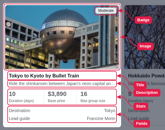
A card displays only the parts you configure, with the exception of the title, which is always displayed. The card builder has the following members:
| Member | Description |
|---|---|
Title() | Specifies the card's title, which links to the record's view page. Defaults to the resource's title, or the record's key when the resource has no title. |
Description() | Specifies the text displayed below the title. |
Image() | Specifies the URL of the image displayed on the card. A record without an image displays a placeholder. |
Badge() | Specifies the property displayed as a badge beside the title, or on the image. A record with an empty value displays no badge. |
Stats() | Adds stats, which are short values displayed in a strip below the title, for example the duration and price of a trip. |
Fields() | Adds fields, which are displayed as labels and values below the stats. |
Arrangement | Specifies how the image and the content are arranged. See card arrangement. |
ActionsPlacement | Specifies where the row actions are displayed. See card arrangement. |
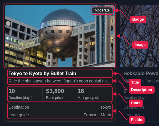
The title and description are displayed as plain text. When a value is too long and gets cut off, users can hover over it to see the full text.
Stats and fields
You can add stats and fields by calling Add() on the stats builder or the fields builder. A card displays a maximum of four stats.
Both builders take an optional callback that allows you to configure the stat or field. The stat or field builder has the following members:
| Member | Description |
|---|---|
Title | Specifies the label displayed with the value. Defaults to the property's [Display(Name)], or else the property name split into words. |
EmptyText | Specifies the text displayed when the value is null or empty. Defaults to the property's [DisplayFormat(NullDisplayText)], or else a dash. |
UseDisplay<TDisplay>() | Renders the value with a different display type. |
Unless specified otherwise, a stat or field renders its value with the same display type StellarAdmin would use for the property in a table column. The example below changes the label of the base price stat, and displays it as a currency:
card.Stats(stats =>
{
    stats.Add(trip => trip.BasePrice, stat =>
    {
        stat.Title = "From";
        stat.UseDisplay<NumberDisplay>(number => number.Format = "C0");
    });
});
Arranging the fields
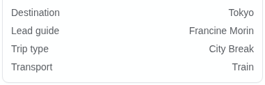
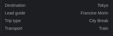
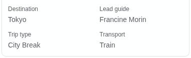
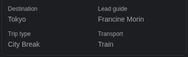
By default, a card displays each field on its own row, with the label at the start and the value at the end. You can display the fields in two columns, with each label above its value, by setting the Layout property of the fields builder to ResourceCardFieldLayout.Grid:
using StellarAdmin.Resources;

card.Fields(fields =>
{
    fields.Layout = ResourceCardFieldLayout.Grid;
    fields.Add(trip => trip.Destination);
    fields.Add(trip => trip.LeadGuide);
    fields.Add(trip => trip.TripType);
    fields.Add(trip => trip.Transport);
});
Changing the badge's display
A badge uses BadgeDisplay by default. You can configure it, or use another display type, by calling UseDisplay() on the badge builder. The example below displays the difficulty as an outline badge:
using StellarAdmin.Resources.Displays;
using StellarAdmin.UI;

card.Badge(trip => trip.Difficulty, badge =>
    badge.UseDisplay<BadgeDisplay>(display => display.Variant = BadgeVariant.Outline));
To vary the badge's color depending on its value, for example a red badge for challenging trips, use a custom display.
Row actions
Each card may display a view, edit or delete action, depending on whether you've enabled the view page, the edit page or the delete action on the resource builder. When the resource has a view page, the card's title links to it, and users can click anywhere on the card to open it. By default, the edit and delete actions are displayed in a menu in the card's header. See card arrangement to display them in the card's footer instead.
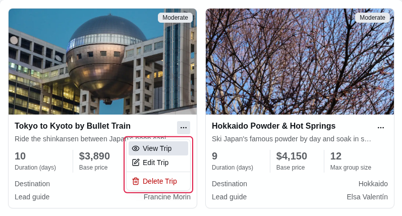
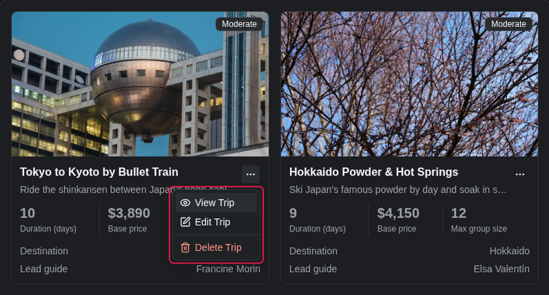
You can hide some of these actions on the cards by calling RowActions() on the cards builder. The example below hides the delete action from the cards, while still allowing users to delete a trip from its view page:
index.AddCards("trips", cards =>
{
    cards.RowActions(actions => actions.Delete = false);
    // ...
});
You can set View, Edit and Delete. Setting an action to true doesn't display an action that isn't enabled on the resource.
Cards with data from a handler
By default, cards display the data from the resource. You can however, display custom data by implementing a data layout handler by passing the item type and the handler as the type arguments of AddCards<TItem, THandler>().
The example below displays a card for each destination with its number of bookings, which links to the destination's view page:
index.AddCards<DestinationRevenue, DestinationRevenueHandler>("destinations", cards =>
{
    cards.LinkTo<Destination>(item => item.DestinationId);
    cards.Card(card =>
    {
        card.Title(item => item.Destination);
        card.Stats(stats => stats.Add(item => item.Bookings));
    });
});
Call HasRecordKey() instead of LinkTo() when each item is a record of the resource itself, so the cards also display the row actions. See data from a handler for how to write the handler.