Columns
Choose the columns a table displays, how they're aligned and how they're grouped
StellarAdmin does not automatically add any columns for a table. You must add columns by calling Columns() on the table builder, which gives you access to the columns builder. You can then call Add() on the columns builder to add a column.
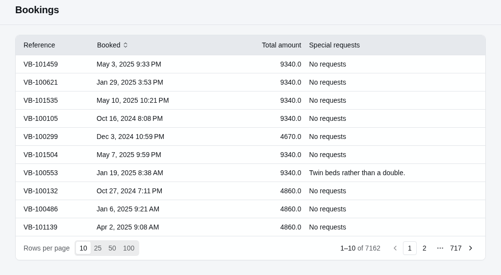
The example below adds four columns to the bookings grid, including additional configuration for the booking date and special requests columns via their respective column builders.
resource.Index(index => index.AddTable("bookings", table => table.Columns(columns =>
{
    columns.Add(booking => booking.Reference);
    columns.Add(booking => booking.BookedAt, column =>
    {
        column.Title = "Booked";
        column.Sortable();
    });
    columns.Add(booking => booking.TotalAmount);
    columns.Add(booking => booking.SpecialRequests, column => column.EmptyText = "No requests");
})));
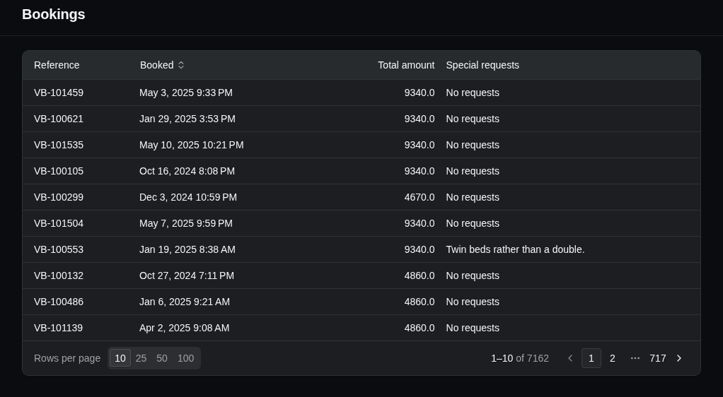
As you've seen in the code sample above, you can pass additional configuration for a column via its column builder. The following members are available on the column builder.
| Member | Description |
|---|---|
Title | Sets the column's header. The default is the property's [Display(Name)], or else the property name split into words, such as "Departure Date". |
Align | Sets how the column's header and values are aligned. The default is the end for numbers, and the start for everything else. |
EmptyText | Sets the text to display when the value is null or empty. The default is the property's [DisplayFormat(NullDisplayText)], or else an empty cell. |
Sortable() | Allows users to sort the grid by the column. |
UseDisplay<TDisplay>() | Renders the value of the column with a different display type. |
UseBuiltInRendering() | Renders the value as text, formatted with the property's [DisplayFormat], instead of with a display. This is useful when you want to opt out of the column's default display type and simply want to display the column value as plain text. |
Control how values are rendered
Unless specified otherwise, a column renders its value with a display type that StellarAdmin chooses from the property's type. For example, numbers are right-aligned, dates are rendered like "3 Nov 2026", a bool is rendered as an icon, and an enum is rendered with its [Display(Name)].
To render a value differently, call UseDisplay() with the display type to use. The example below renders the total as a currency by using the NumberDisplay and setting its Format property:
using StellarAdmin.Resources.Displays;

columns.Add(booking => booking.TotalAmount, column =>
    column.UseDisplay<NumberDisplay>(number => number.Format = "C"));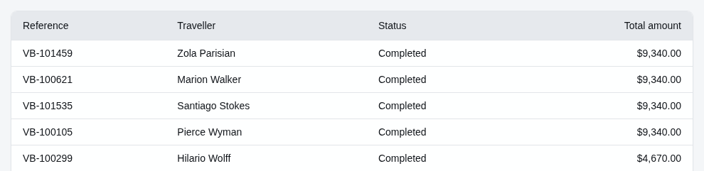
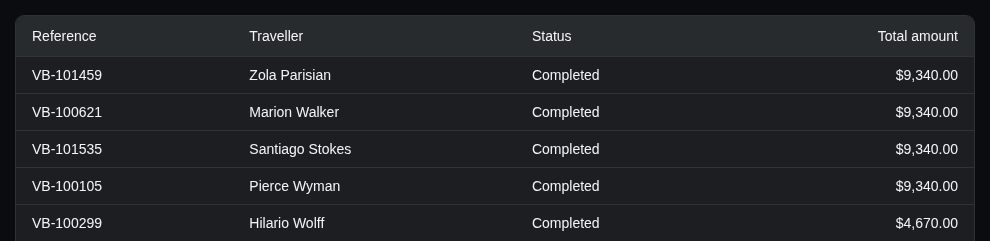
See displays for every display type and its settings.
Displaying related records
You can reference related resources in columns. For EF Core, StellarAdmin will automatically detect the navigation property and include the referenced entity when loading the data.
columns.Add(booking => booking.Traveller);
columns.Add(booking => booking.Traveller.Email, column => column.Title = "Traveller email");
For the Traveler property, StellarAdmin will see it is a related resource and use the title of that resource as the display value.
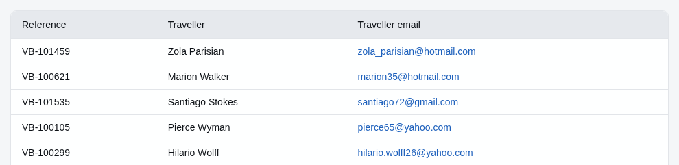
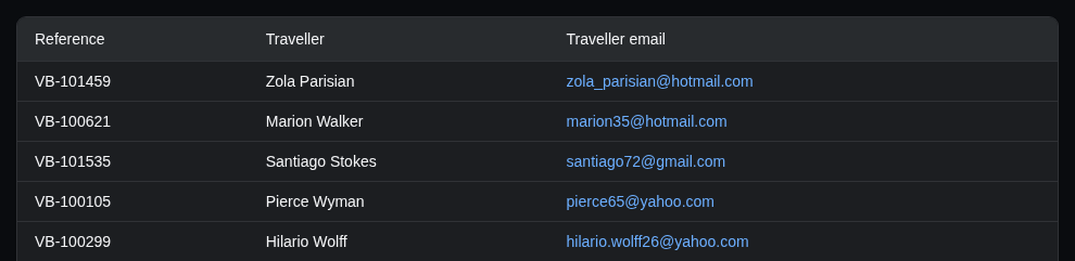
See displaying related records for more information on how StellarAdmin display related records.
Displaying computed values
A column can display any expression, not just a property. The example below displays the travel dates as a date range.
columns.Add(
    booking => $"{booking.Departure.StartDate:d MMM} – {booking.Departure.EndDate:d MMM yyyy}",
    column =>
    {
        column.Title = "Travel dates";
        column.Sortable(booking => booking.Departure.StartDate);
    });
A computed column must specify a Title, because there's no property from which to resolve the title. If the column is sortable, you must also pass a sort expression to Sortable(), since StellarAdmin cannot sort by computed values.
Aligning columns
By default, columns are aligned to the start (left). Columns that display numbers are aligned to the right (end). You can set the alignment explicitly using the Align property. The alignment applies to the column's header and its values. The example below centers the booking status:
using StellarAdmin.UI;

columns.Add(booking => booking.Status, column => column.Align = DataGridColumnAlign.Center);
Grouping columns
Column headers can be grouped together by calling AddGroup() on the column builder, passing the title of the column and an action that receives a column group builder as the second parameter. Use the column group builder to add columns to the group. You can also nest groups multiple levels deep.
The example below groups the trip and its dates under Departure, and the dates in a nested Dates group:
resource.Index(index => index.AddTable("bookings", table => table.Columns(columns =>
{
    columns.Add(booking => booking.Reference);
    columns.AddGroup("Departure", departure =>
    {
        departure.Add(booking => booking.Departure.Trip.Title, column => column.Title = "Trip");
        departure.AddGroup("Dates", dates =>
        {
            dates.Add(booking => booking.Departure.StartDate, column =>
            {
                column.Title = "Starts";
                column.Sortable();
            });
            dates.Add(booking => booking.Departure.EndDate, column => column.Title = "Ends");
        });
    });
    columns.Add(booking => booking.TotalAmount);
})));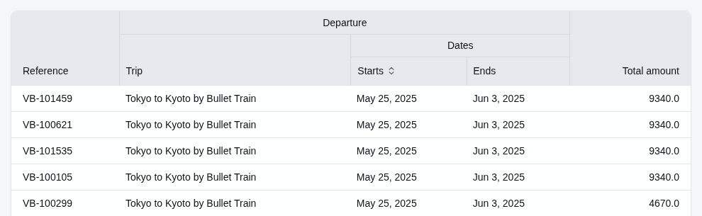
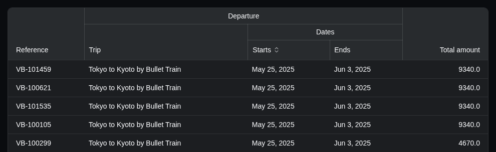
A group's header is centered above its column headers. To align it differently, set the group's Align to DataGridColumnGroupAlign.Start or DataGridColumnGroupAlign.End.
Writing your own cell markup
If you have special requirements for rendering the display value, which is not covered by any of the built-in display types, you can create a custom display.