Row details
Expand a row to display more about a record
Introduction
Row details allow users to expand a row in the grid to see more about a record without leaving the index page.
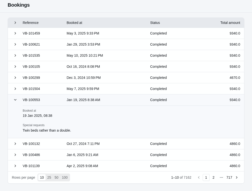
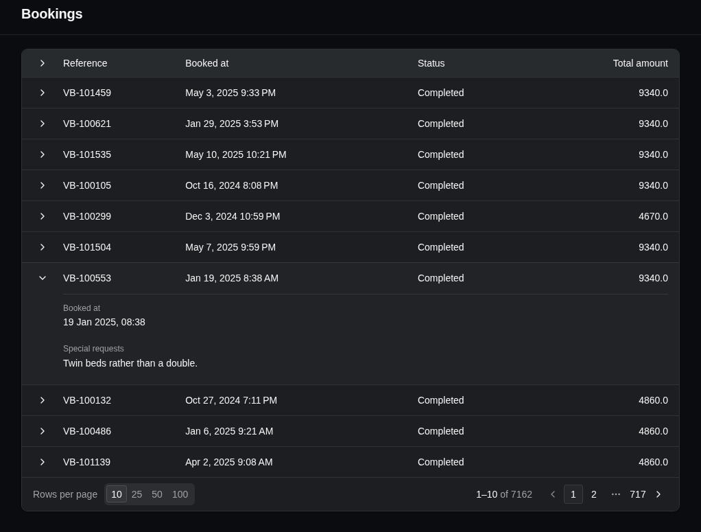
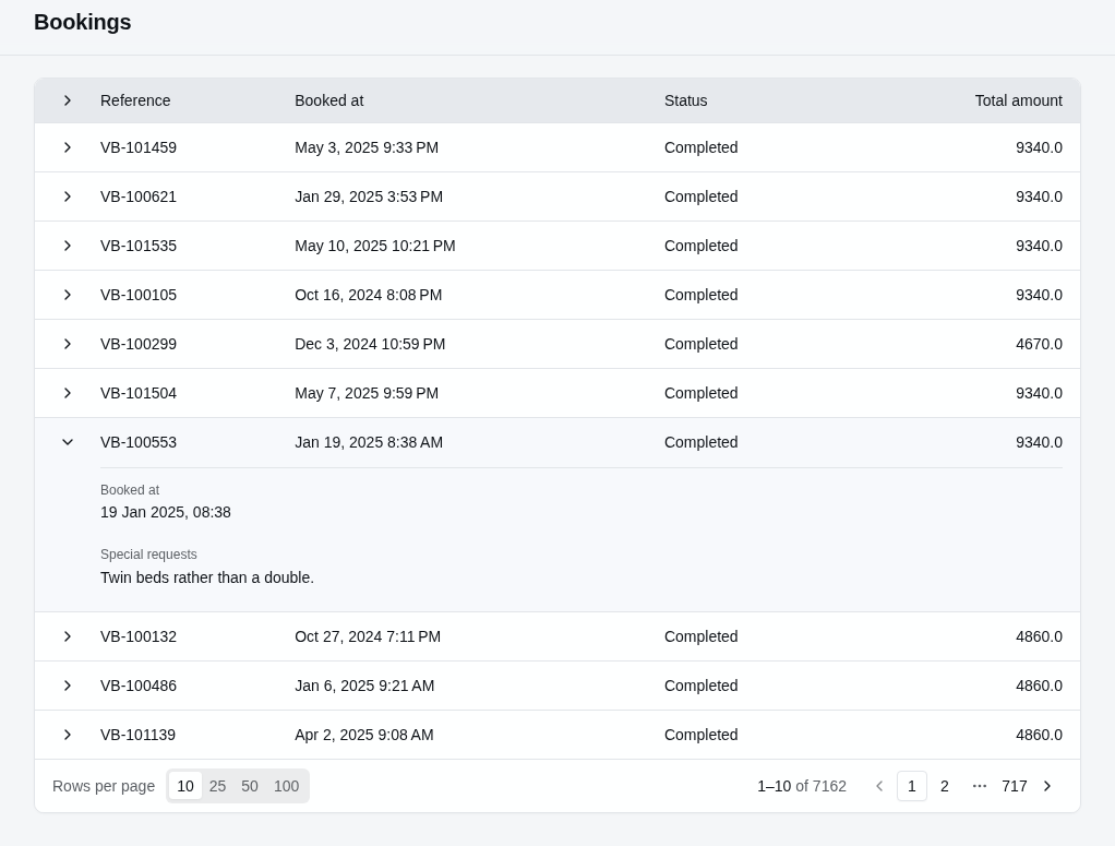
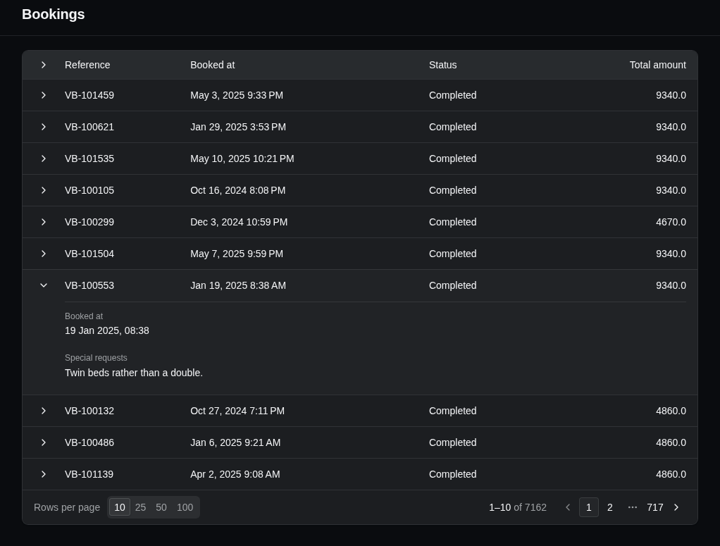
Call EnableRowDetails() on the table builder with the name of the partial view that renders the detail. The example below renders the _BookingSummary partial view when someone expands a booking's row:
resource.Index(index => index.AddTable("bookings", table =>
{
    // ...
    table.EnableRowDetails("_BookingSummary");
}));
The _BookingSummary partial view below displays the booking date and any special requests:
@model Booking

<sa-details>
    <sa-display-field asp-for="BookedAt" format="{0:d MMM yyyy, HH:mm}" />
    <sa-display-field asp-for="SpecialRequests" />
</sa-details>
StellarAdmin renders the partial view with the index page, and passes the row's record as its model. Place the partial view in Areas/StellarAdmin/Views/{resourceSlug}/, for example Areas/StellarAdmin/Views/bookings/, or in Areas/StellarAdmin/Views/Shared/.
If you use the StellarAdmin.UI Tag Helpers like the partial above, be sure to add a _ViewImports.cshtml file that registers the StellarAdmin Tag Helpers, otherwise the <sa-details> will render as plain text.
Lazy loading data when a row expands
A row's details may need data that isn't part of the row's record, such as related records or data from another service. Instead of loading this data for every row on the index page, StellarAdmin can load it only once someone expands a row.
To implement this behaviour, create a handler that implements IResourceRowDetailHandler<TModel>, where TModel is the partial view's model. The FindAsync() method receives the row's key, and must return the model to be passed to the partial view.
The example below loads a booking's history from a service:
using StellarAdmin.Resources;

public class BookingHistoryHandler(BookingHistoryService history)
    : IResourceRowDetailHandler<BookingHistory>
{
    public Task<BookingHistory?> FindAsync(string id, CancellationToken cancellationToken) =>
        history.FindAsync(int.Parse(id), cancellationToken);
}
Then pass the partial view's model and the handler as the type arguments of EnableRowDetails<TModel, THandler>().
table.EnableRowDetails<BookingHistory, BookingHistoryHandler>("_BookingHistory");StellarAdmin registers the handler as a scoped service, unless you've already registered it, so its constructor can take your own services.
Remember to specify the type returned from your handler as the model of your partial view.
@model BookingHistory?

<!-- your code that renders the booking history -->
Multiple detail sections
A single row can contain multiple detail sections. To do this, use the overload for EnableRowDetails() that takes a row details panel builder and add individual detail panels by calling its Add() method. The example below adds Summary, Pricing and History panels:
table.EnableRowDetails(panels =>
{
    panels.Add("Summary", "_BookingSummary");
    panels.Add("Pricing", "_BookingPricing", booking => new BookingPricing(
        booking.TotalAmount, booking.Passengers.Count, booking.Departure.Trip.BasePrice));
    panels.Add<BookingHistory, BookingHistoryHandler>("History", "_BookingHistory");
});
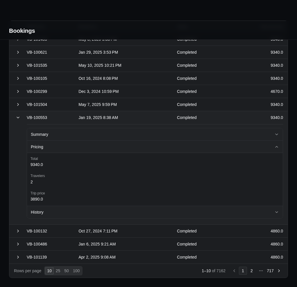
StellarAdmin displays the detail panels in an accordion, with every panel closed when a row expands. It loads a panel's data the first time a user opens the panel. If you add only one panel, StellarAdmin displays it without an accordion.
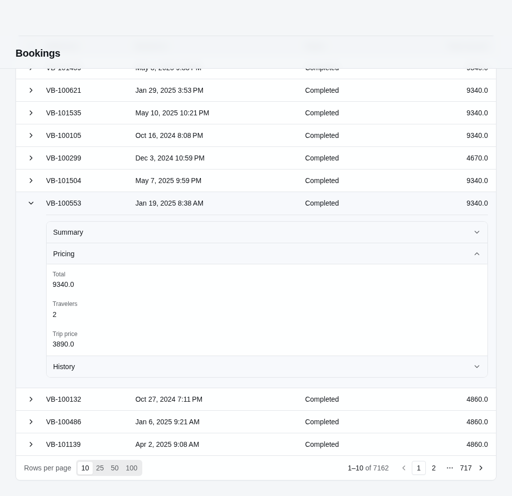
To display an icon in front of a panel's title, set Icon on the row details builder. The example below adds a receipt icon to the Pricing panel:
table.EnableRowDetails(panels =>
{
    panels.Add("Summary", "_BookingSummary");
    panels.Add("Pricing", "_BookingPricing").Icon = "receipt";
});
Displaying the panels as tabs
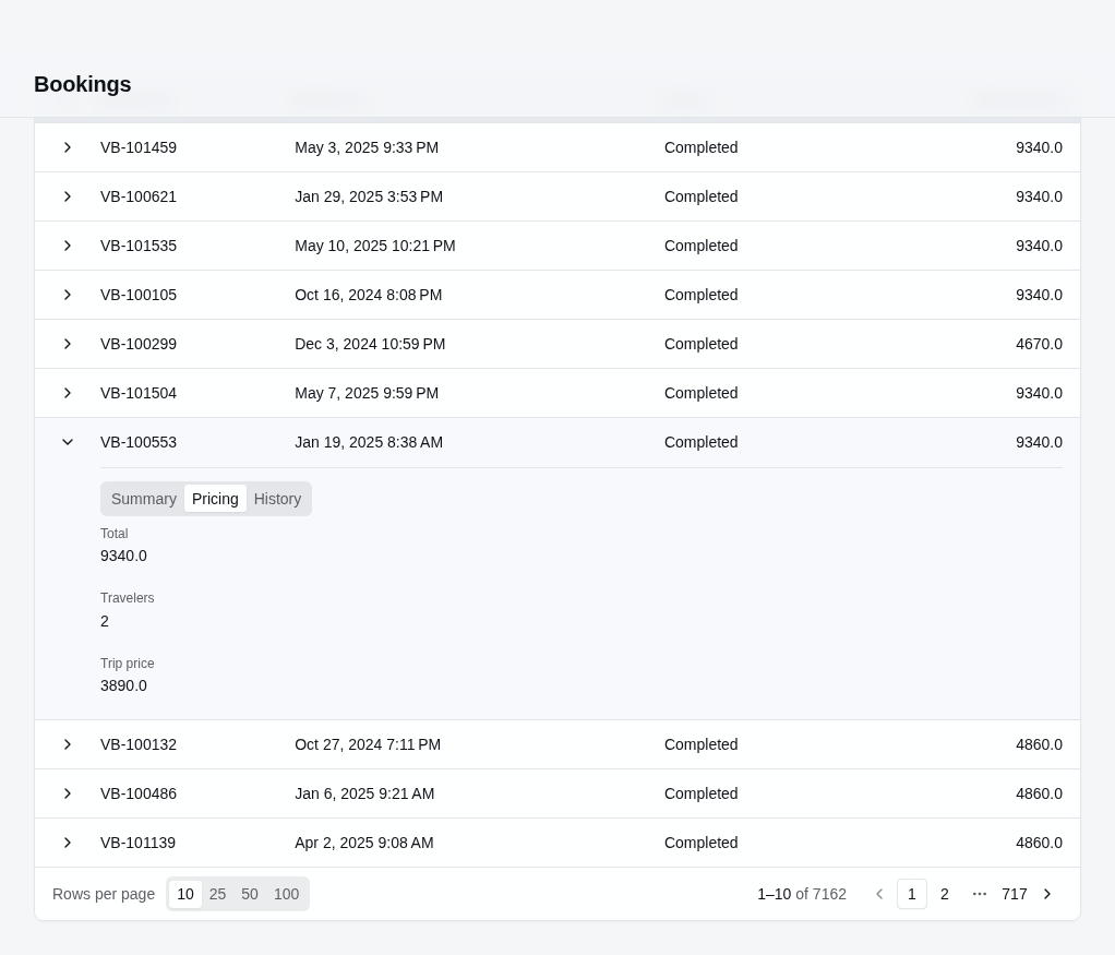
To change how the panels are laid out, set PanelLayout on the panel builder. The example below displays the panels as tabs:
using StellarAdmin.Resources;

table.EnableRowDetails(
    panels =>
    {
        panels.Add("Summary", "_BookingSummary");
        panels.Add("Pricing", "_BookingPricing", booking => new BookingPricing(
            booking.TotalAmount, booking.Passengers.Count, booking.Departure.Trip.BasePrice));
        panels.Add<BookingHistory, BookingHistoryHandler>("History", "_BookingHistory");
    },
    details =>
    {
        details.PanelLayout = ResourceRowDetailPanelLayout.Tabs();
    });
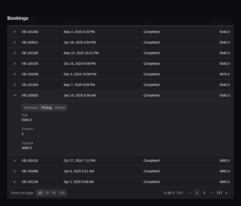
PanelLayout can be set to the following:
| Layout | What it displays |
|---|---|
ResourceRowDetailPanelLayout.Accordion() | An accordion in which any number of panels can be open at once. This is the default. |
ResourceRowDetailPanelLayout.Accordion(ResourceRowDetailAccordionExpandMode.Single) | An accordion in which opening a panel closes the panel that was open. |
ResourceRowDetailPanelLayout.Tabs() | Tabs on a muted background. |
ResourceRowDetailPanelLayout.Tabs(ResourceRowDetailTabStyle.Line) | Tabs with an underline below the selected tab. |
With tabs, the first tab is selected when a row expands, and StellarAdmin loads a panel's data the first time someone selects its tab.
Changing how rows expand
Each overload of EnableRowDetails() also passes a details builder you can use to configures how rows expand. The example below lets only one row expand at a time, expands a row when it's clicked anywhere, and marks the expanded row with a rail:
using StellarAdmin.UI;

table.EnableRowDetails("_BookingSummary", details =>
{
    details.ExpandMode = DataGridRowDetailExpandMode.Single;
    details.RowClick = true;
    details.Emphasis = DataGridRowDetailEmphasis.Rail;
});| Setting | What it does |
|---|---|
ExpandMode | Multiple, the default, lets several rows expand at once. Single collapses the expanded row when another row expands. |
RowClick | When true, clicking anywhere in a row expands it, not only clicking its toggle button. Links, buttons and form controls in the row keep their own behavior. The default is false. |
Toggle | Places the toggle button at the Start of the row, the default, or at the End. None leaves it out. |
Emphasis | Sets the expanded row apart from the rows around it with a Band, the default, or a Rail. None doesn't set it apart. |
Divider | Sets the line between the row and its details: Inset, the default, FullWidth or None. |
Inset | Lines the details up with the columns with Aligned, the default, or starts them at the edge of the grid with Bleed. |
Animate | When true, the default, the details animate as they open and close. They don't animate when the user prefers reduced motion. |
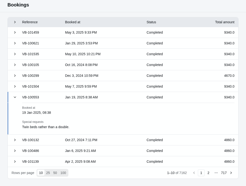
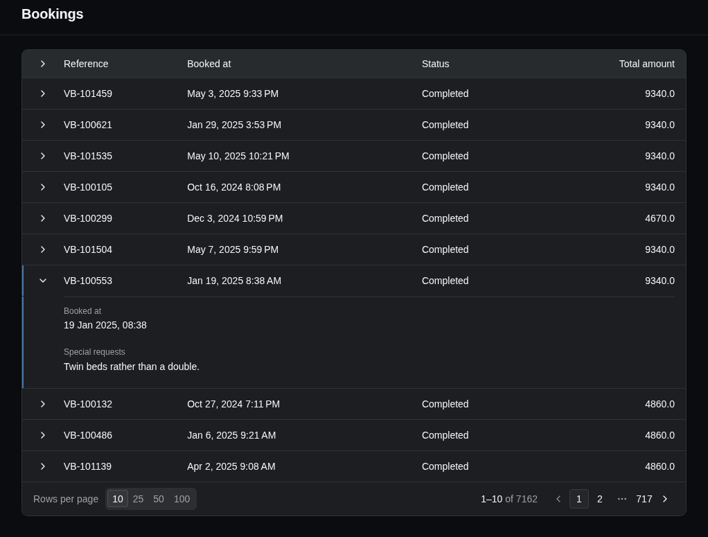
These settings match the row details of the StellarAdmin.UI data grid.